"Great people don't do different things, they do things differently" holds true for us as we exactly the same for our valued customers. That's why we are the market leader of prominence to provide web solutions to businesses across different sectors...

The team at Digitilsm is dedicated to its customers and partners. We are essentially a client oriented company both in our ideas and realizations. We passionately believe in a customer centric approach ensuring a seamless 24x7 customer support system at every step of the project or product development.

Digitlism team strives to deliver cost effective business solutions to its customers. Our Team conducts thorough quality checks at every step of the project ensuring quality business solutions to the clients. We understand that time is money so all our products are planned and executed to achieve timely delivery.

We understand that every business has different needs hence; we communicate closely with our clients in order to provide them with the best possible solutions. We respect our customers and work on the basis of their approaches and business practices while incorporating the benefits of new age technology.
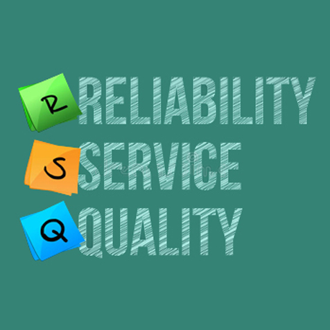
Aiming to deliver consistent value to our clients we have project managers assigned to each and every product. Over the years we have build a team with experienced IT professionals who not only possess business analytical skills, but also has experience in implementation and project-management.


 html5
html5Lorem ipsum dolor sit amet, consectetur adipisicing elit. Eaque, nulla, illo laborum illum natus accusantium eius nesciunt at neque sint cum fuga suscipit ea consectetur? Amet sint quis enim aliquam officia facilis rem explicabo debitis ex dicta aperiam repellendus suscipit assumenda non iste facere aperiam sequi veniam ab facilis sunt. Officiis temporibus officia, recusandae delectus perspiciatis maiores tempore corporis. Accusantium id quasi est numquam pariatur ipsum reiciendis culpa explicabo, quae, fugiat rem doloremque temporibus officiis mollitia expedita illum et non minima dicta, nesciunt perferendis! Inventore delectus sapiente repellat ea, accusantium. Facilis totam ut nobis, omnis.
 css3
css3Lorem ipsum dolor sit amet, consectetur adipisicing elit. Eaque, nulla, illo laborum illum natus accusantium eius nesciunt at neque sint cum fuga suscipit ea consectetur? Amet sint quis enim aliquam officia facilis rem explicabo debitis ex dicta aperiam repellendus suscipit assumenda non iste quam maxime officiis asperiores, accusantium veritatis. Eveniet soluta voluptates, fugit error cumque alias fuga repellat, ad voluptatibus amet perferendis blanditiis. Aut dignissimos, voluptas id, reiciendis harum ipsa non consectetur odit voluptatem eaque quaerat laboriosam ex corrupti iste. Distinctio corporis molestias a, nam explicabo at repellat eos incidunt temporibus quod aspernatur, voluptatem provident voluptatibus alias repudiandae, facere aperiam sequi veniam ab facilis sunt. Officiis temporibus officia, recusandae delectus perspiciatis maiores tempore corporis.
 mysql
mysqlLorem ipsum dolor sit amet, consectetur adipisicing elit. Eaque, nulla, illo laborum illum natus accusantium eius nesciunt at neque sint cum fuga suscipit ea consectetur? Amet sint quis enim aliquam officia facilis rem explicabo debitis ex dicta aperiam repellendus suscipit assumenda non iste quam maxime officiis asperiores, accusantium veritatis. Eveniet soluta voluptates, fugit error cumque alias fuga repellat, ad voluptatibus amet perferendis blanditiis. Aut dignissimos, voluptas id, reiciendis harum ipsa non consectetur odit voluptatem eaque quaerat laboriosam ex corrupti iste. Distinctio corporis molestias a, nam explicabo at repellat eos incidunt temporibus quod aspernatur, voluptatem provident voluptatibus alias repudiandae,
 ionic
ionicLorem ipsum dolor sit amet, consectetur adipisicing elit. Eaque, nulla, illo laborum illum natus accusantium eius nesciunt at neque sint cum fuga suscipit ea consectetur? Amet sint quis enim aliquam officia facilis rem explicabo debitis ex dicta aperiam repellendus suscipit assumenda non iste quam maxime officiis asperiores, accusantium veritatis. Eveniet soluta voluptates, fugit error cumque alias fuga repellat, ad voluptatibus amet perferendis blanditiis. Aut dignissimos, voluptas id, reiciendis harum ipsa non consectetur odit voluptatem eaque quaerat laboriosam ex corrupti iste. Distinctio corporis molestias a, nam explicabo at repellat eos incidunt temporibus quod aspernatur,
 php7
php7Lorem ipsum dolor sit amet, consectetur adipisicing elit. Eaque, nulla, illo laborum illum natus accusantium eius nesciunt at neque sint cum fuga suscipit ea consectetur? Amet sint quis enim aliquam officia facilis rem explicabo debitis ex dicta aperiam repellendus suscipit assumenda non iste quam maxime officiis asperiores, accusantium veritatis. Eveniet soluta voluptates, fugit error cumque alias fuga repellat, ad voluptatibus amet perferendis blanditiis. Aut dignissimos, voluptas id, reiciendis harum ipsa non consectetur odit voluptatem eaque quaerat laboriosam ex corrupti iste. Distinctio corporis molestias a, nam explicabo at repellat eos incidunt temporibus quod aspernatur, voluptatem provident voluptatibus alias repudiandae, facere aperiam sequi veniam ab facilis sunt.
 mongo DB
Aut dignissimos, voluptas id, reiciendis harum ipsa non consectetur odit voluptatem eaque quaerat laboriosam ex corrupti iste. Distinctio corporis molestias a, nam explicabo at repellat eos incidunt temporibus quod aspernatur, voluptatem provident voluptatibus alias repudiandae, facere aperiam sequi veniam ab facilis sunt. Officiis temporibus officia, recusandae delectus perspiciatis maiores tempore corporis. Accusantium id quasi est numquam pariatur ipsum reiciendis culpa explicabo, quae, fugiat rem doloremque temporibus officiis mollitia expedita illum et non minima dicta, nesciunt perferendis! Inventore delectus sapiente repellat ea, accusantium. Facilis totam ut nobis, omnis.
 angular
Lorem ipsum dolor sit amet, consectetur adipisicing elit. Eaque, nulla, illo laborum illum natus accusantium eius nesciunt at neque sint cum fuga suscipit ea consectetur? Amet sint quis enim aliquam officia facilis rem explicabo debitis ex dicta aperiam repellendus suscipit assumenda non iste quam maxime officiis asperiores, accusantium veritatis. Distinctio corporis molestias a, nam explicabo at repellat eos incidunt temporibus quod aspernatur, voluptatem provident voluptatibus alias repudiandae, facere aperiam sequi veniam ab facilis sunt. Officiis temporibus officia, recusandae delectus perspiciatis maiores tempore corporis. Accusantium id quasi est numquam pariatur ipsum reiciendis culpa explicabo, quae, fugiat rem doloremque temporibus officiis mollitia expedita illum et non minima dicta, nesciunt perferendis! Inventore delectus sapiente repellat ea, accusantium. Facilis totam ut nobis, omnis.

Lorem ipsum dolor sit amet, consec adipiscing elit. Nam eusem scelerisque tempor, varius quam luctus dui. Mauris magna metus nec.
Paula Wilson
Lorem ipsum dolor sit amet, consec adipiscing elit. Nam eusem scelerisque tempor, varius quam luctus dui. Mauris magna metus nec.
Paula Wilson
Lorem ipsum dolor sit amet, consec adipiscing elit. Nam eusem scelerisque tempor, varius quam luctus dui. Mauris magna metus nec.
Paula Wilson
Lorem ipsum dolor sit amet, consec adipiscing elit. Nam eusem scelerisque tempor, varius quam luctus dui. Mauris magna metus nec.
Paula Wilson
Lorem ipsum dolor sit amet, consec adipiscing elit. Nam eusem scelerisque tempor, varius quam luctus dui. Mauris magna metus nec.
Paula Wilson
Lorem ipsum dolor sit amet, consec adipiscing elit. Nam eusem scelerisque tempor, varius quam luctus dui. Mauris magna metus nec.
Paula Wilson